Uno Health
Designing a new way for caregivers to assist members on their Uno Health journey.
Role
Product Designer
Date:
April 2024
Team
Alejandro Jackson,
Joshua Lim,
Joe Maffa
Skills
Product Design
Figma
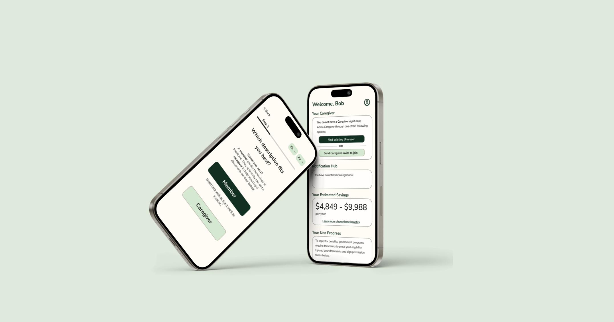
Overview
Uno Health is a startup that aims to improve access to Medicare by increasing the ease with which people can apply for Medicare savings. Think Sprintax but for Medicare– Uno Health simplifies the process by applying for Medicare programs on behalf of its members.
Many Medicare members have caregivers or family members who help them manage their healthcare and finances. However, Uno Health’s digital service currently has little support for allowing caregivers to be involved in the enrollment process for Medicare members.
Thus, our team embarked on a mission to design a mobile interface that would enable caregivers to support their carees on their Uno journey.
Exploring the Problem
🚩Problem
Uno Health's digital services currently has little support for allowing caregivers to be involved in the Uno enrollment process. As many members may need assistance with digital-related tasks, this is a critical gap that needs to be addressed.
🎯Objective
To integrate caregiver support into the existing mobile interface flow.
👍Success Metrics
- It must be possible for a caregiver of a member to initiate the enrollment process with Uno Health.
- It must be possible for a member to invite a caregiver to support them during the enrollment process.
User Research
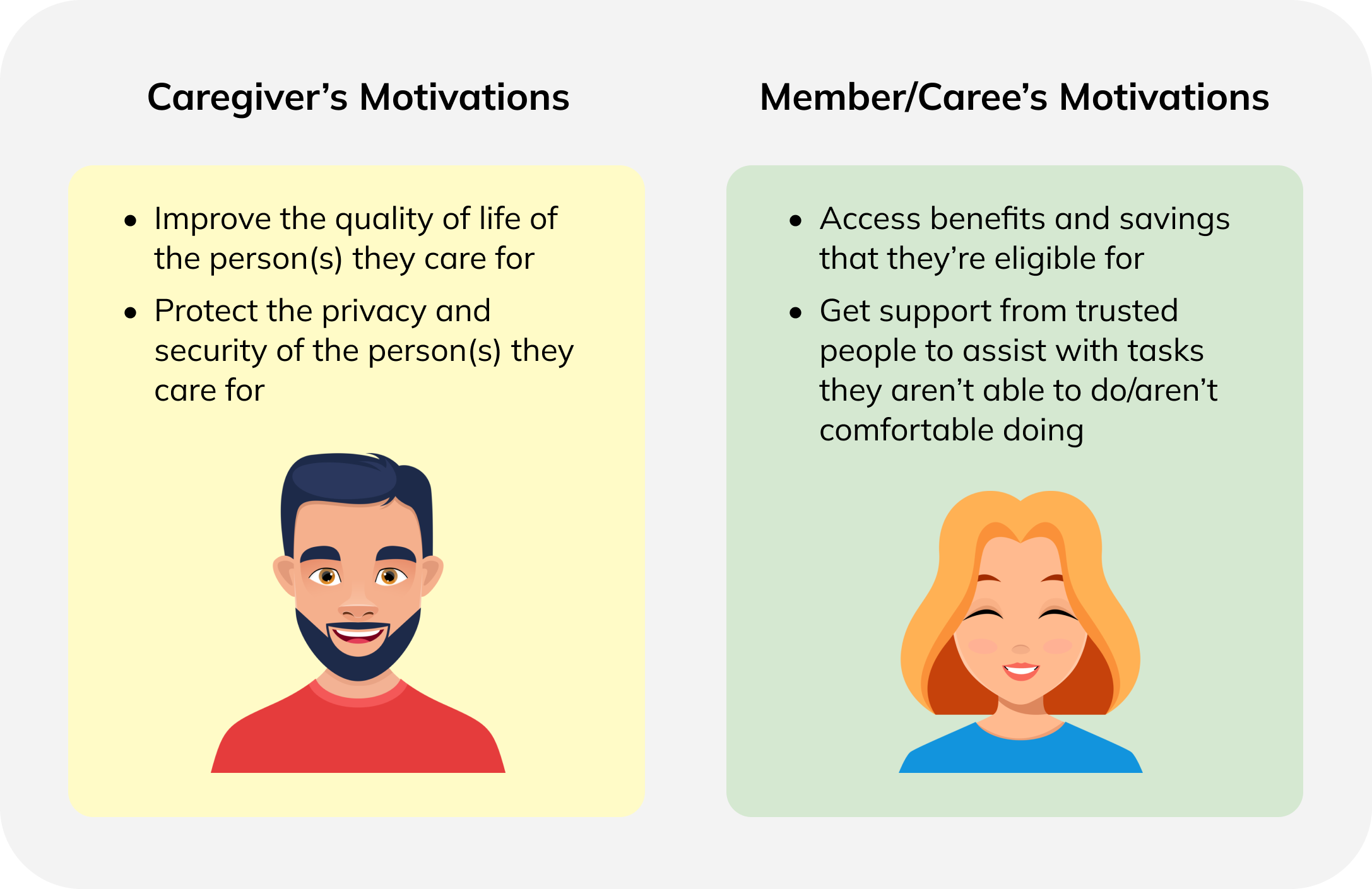
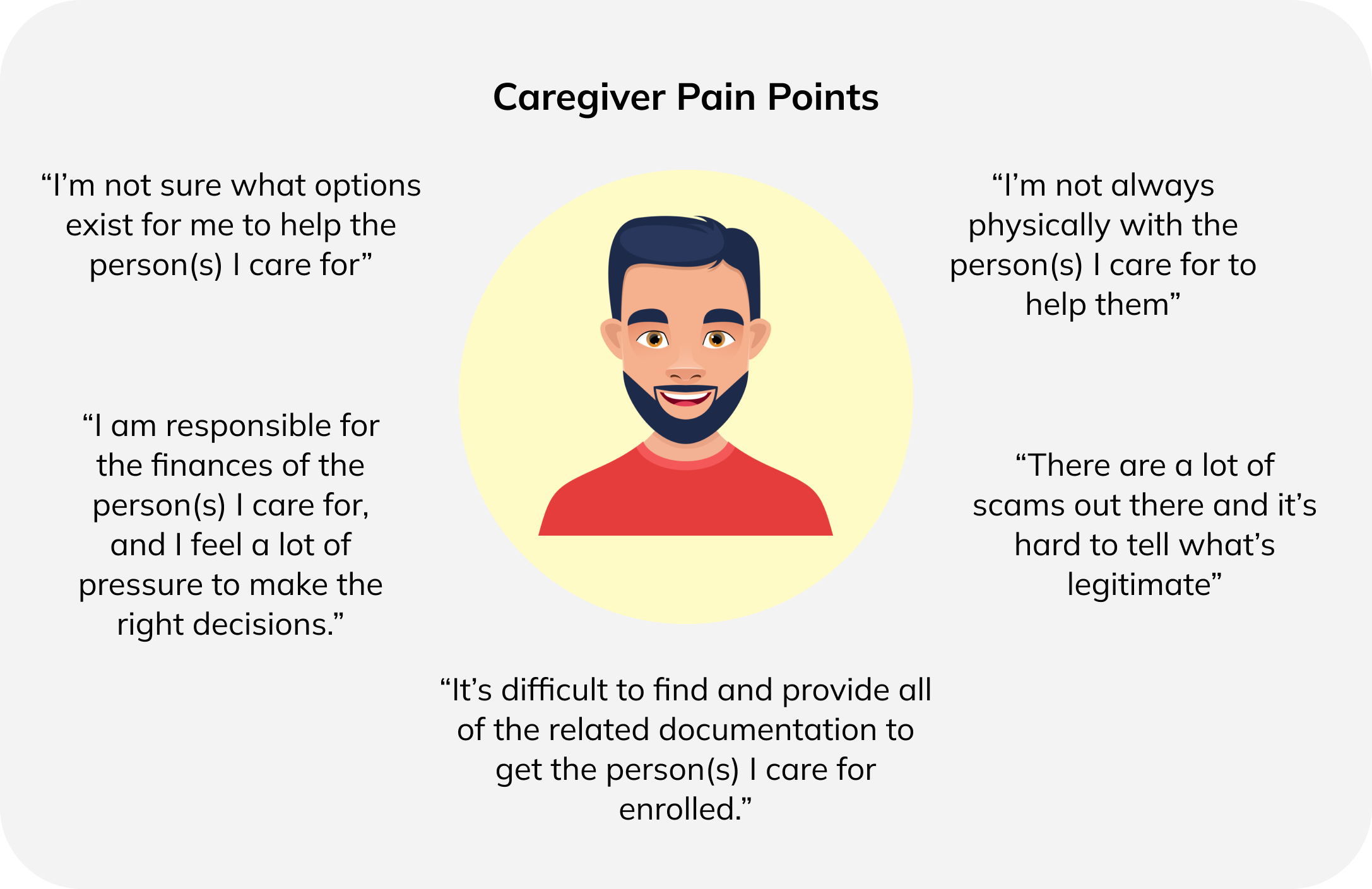
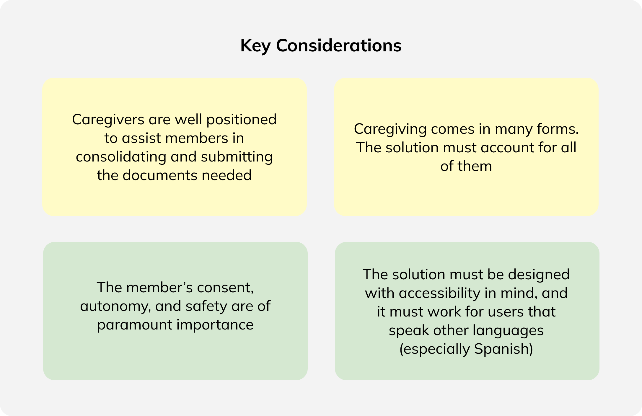
From speaking with Elise, the Lead Designer at Uno Health, we learnt about the motivations, pain points and considerations of current and prospective Uno Health members. For the sake of clarity, we will use Member/Caree to refer to the Medicare member for the rest of this discussion.
User Motivations
User Pain Points
User Considerations
Key Questions
Since our brief was broad, there were many directions that our project could take. Our key debates before we embarked on the design process were:
- Should we create a separate account for the caregiver? Or should we simply give caregivers access to the caree's account?
- If we design an entirely separate account for the caregiver, how can we enable the caregiver to support the caree during their enrollment process?
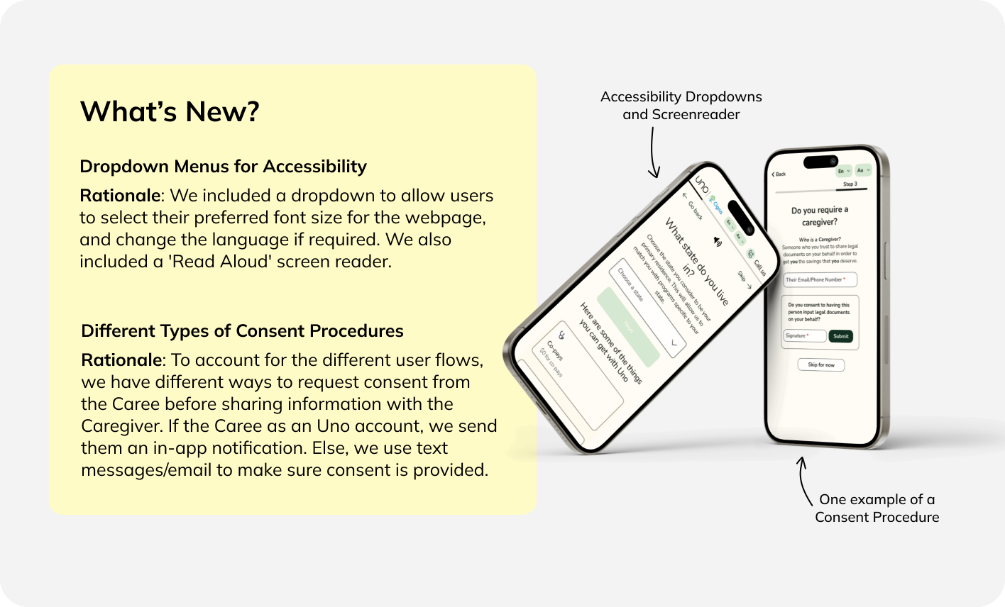
- How do we protect the caree's privacy? How do we ensure that consent is given before data sharing (if any) occurs?
- If we design a separate account for the caregiver, should we allow a bidirectional linkage of both the caree and caregiver account? Should both parties be able to initiate a connection?
Initial Designs
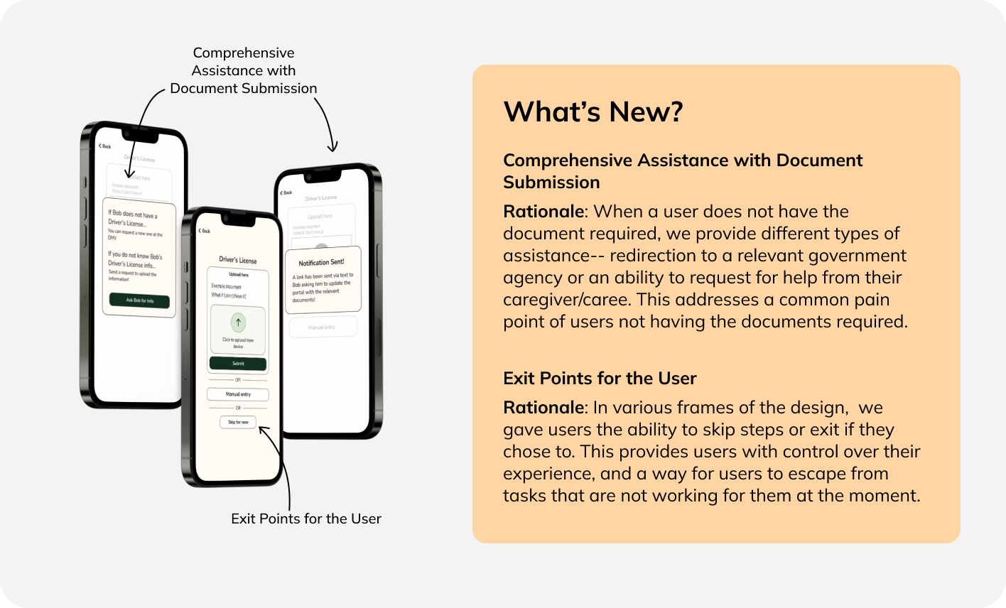
I embarked on the design process by first creating two sketches of the user flow on the mobile app. These sketches incorporated the idea of having a separate caregiver account. I also wanted to prioritize caree consent, and exit paths for users who may not have the documents required in that moment
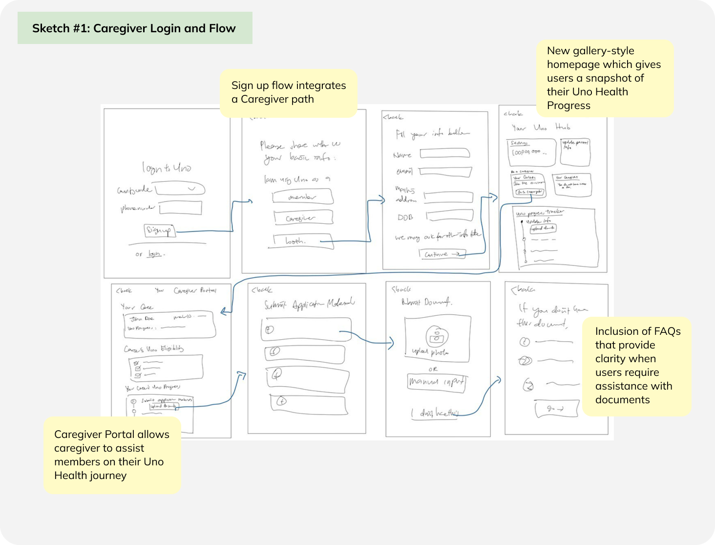
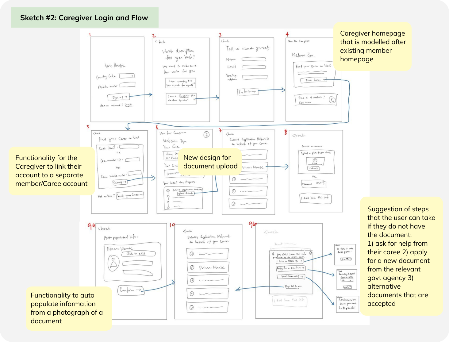
After trading sketches and discussing various possible implementations, our team decided to include the following elements in our design:
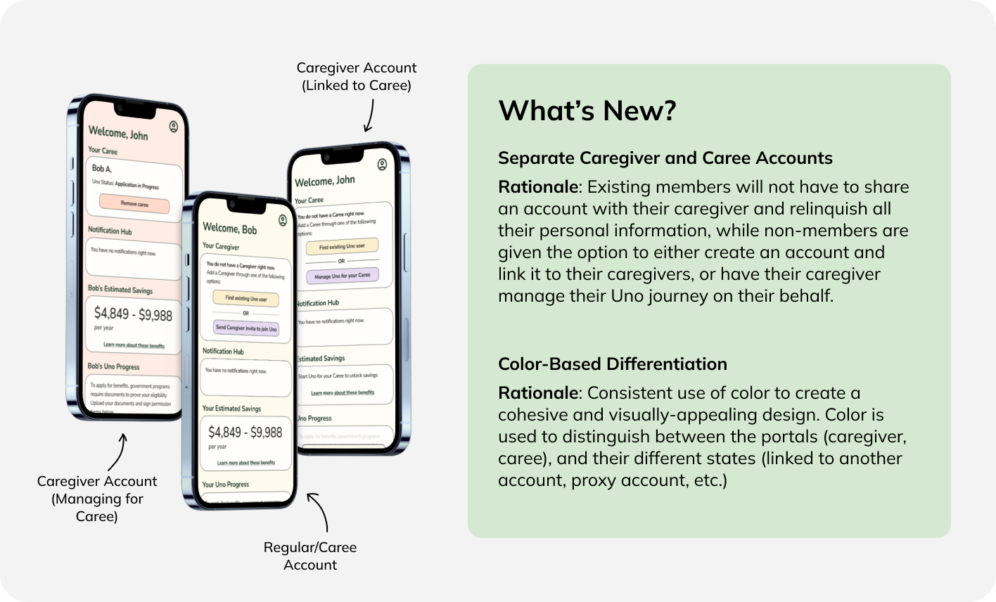
- The creation of a separate 'Caregiver' account.
- A decision point after sign-up for the user to choose their path as either a member/caree or caregiver.
- The ability to add a caregiver/caree at different points in the user's journey.
- Requiring consent of the caree before the caregiver could link their accounts, and vice versa.
- A connection between the eligibility flow (used to verify eligibility for the different Medicare programs) and the member portal.
- The ability to manage caregiver/caree connection on the user's home page.
- The ability for a caregiver/caree to seek help from the other with tasks.
- Assistance if the user is confused about the document submission process.
Wireframes
With our chosen features in mind, we created low-fidelity wireframes to validate our proposed solution and uncover any blindspots that we had overlooked. I was responsible for the home and utility screens of the member portal flow.
Initial Wireframes
After we produced this first set of wireframes, we collected feedback from our peers, industry professionals and Elise from Uno Health. Below is a summary of their comments:
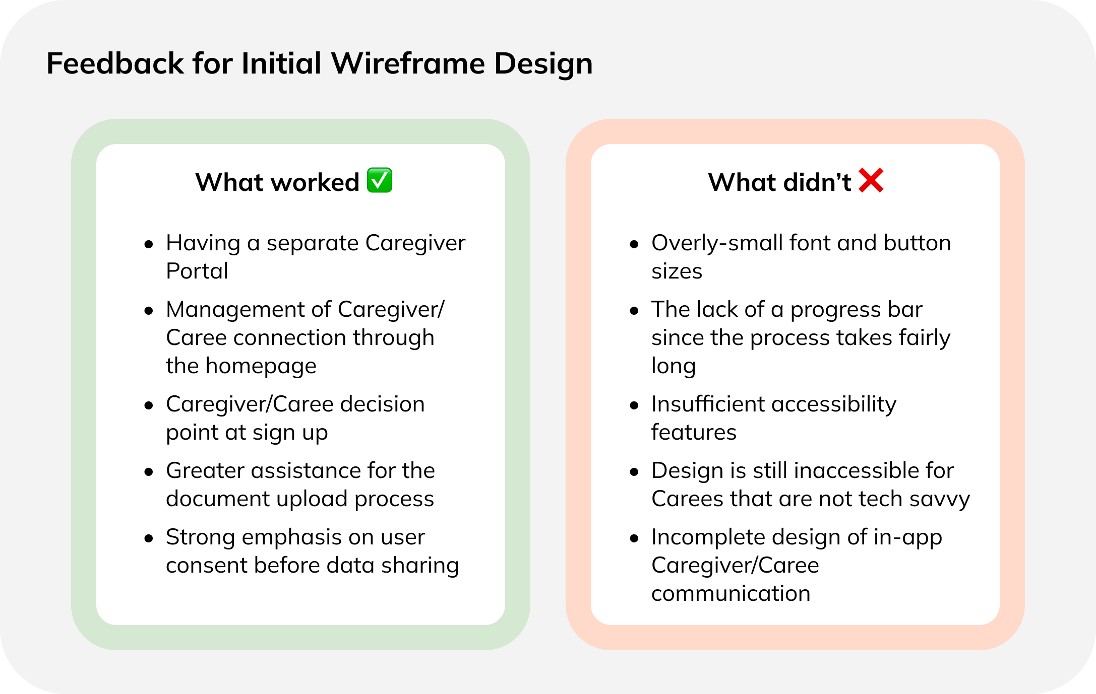
Revised Wireframes
Based on the feedback, we updated our wireframes. The details of the different changes we made are annoted within the Figma below.
With this design update, we focused on improving accessibility, and creating a way for less tech-savvy users to still benefit from Uno. We chose to create a flow which allowed caregivers to enroll their caree in Uno, without requiring the Caree to sign up for a separate Uno account by themselves. This improved on our previous flow, which required the linking of Caregiver and Caree accounts.
Prototypes
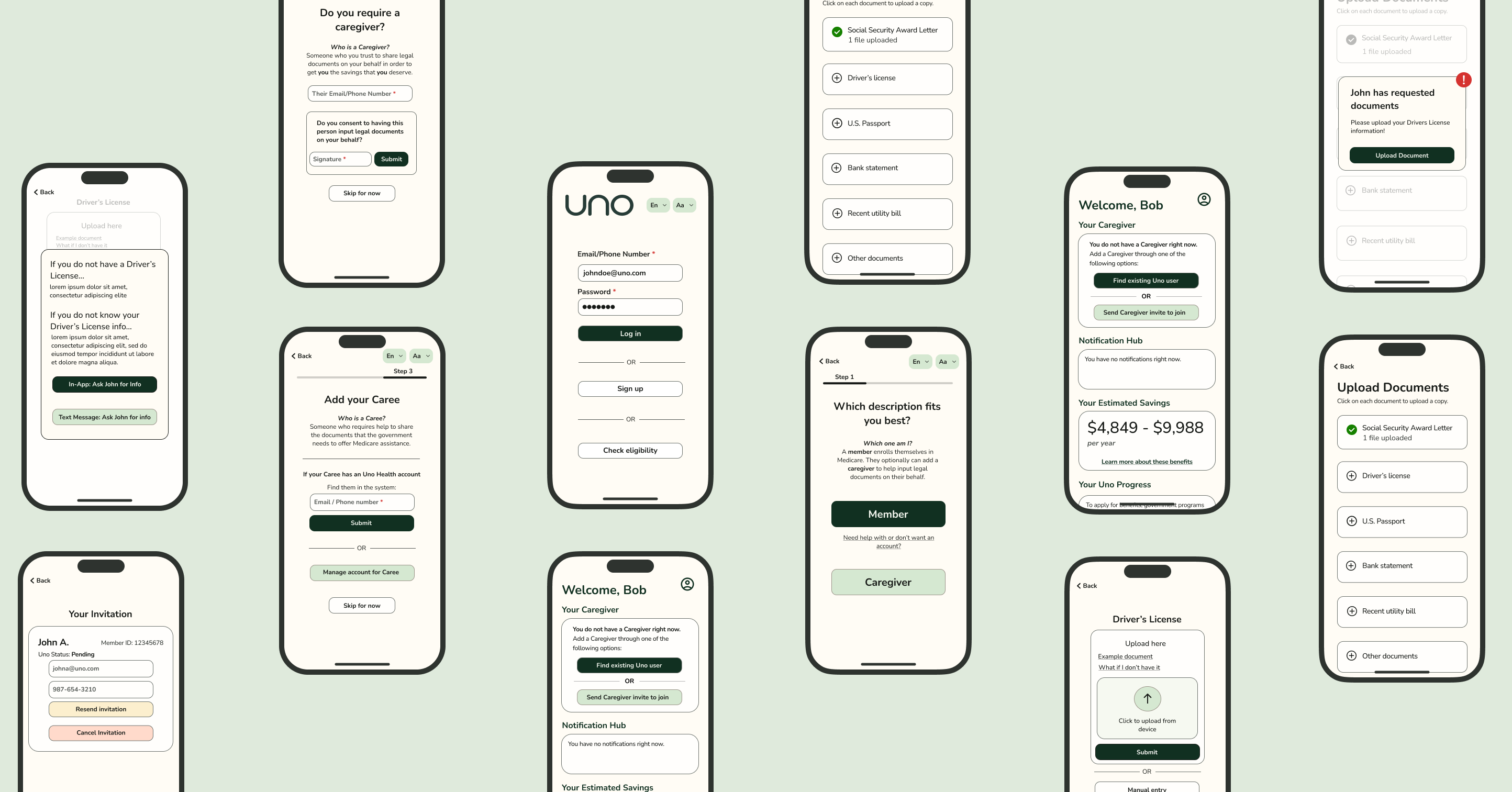
After using the wireframes to validate that our designs were functional and that the flows were smooth, we created a high-fidelity prototype! When designing this, we worked off an existing style guide from Uno Health, and redesigned certain elements such as buttons for a more streamlined look.
First Draft of Our High-Fidelity Prototype
Design Highlights
Final Feedback and Revision
We shared our high-fidelity prototype with Elise, the Design Lead at Uno Health, for final feedback on our design. Her main comments were for us to:
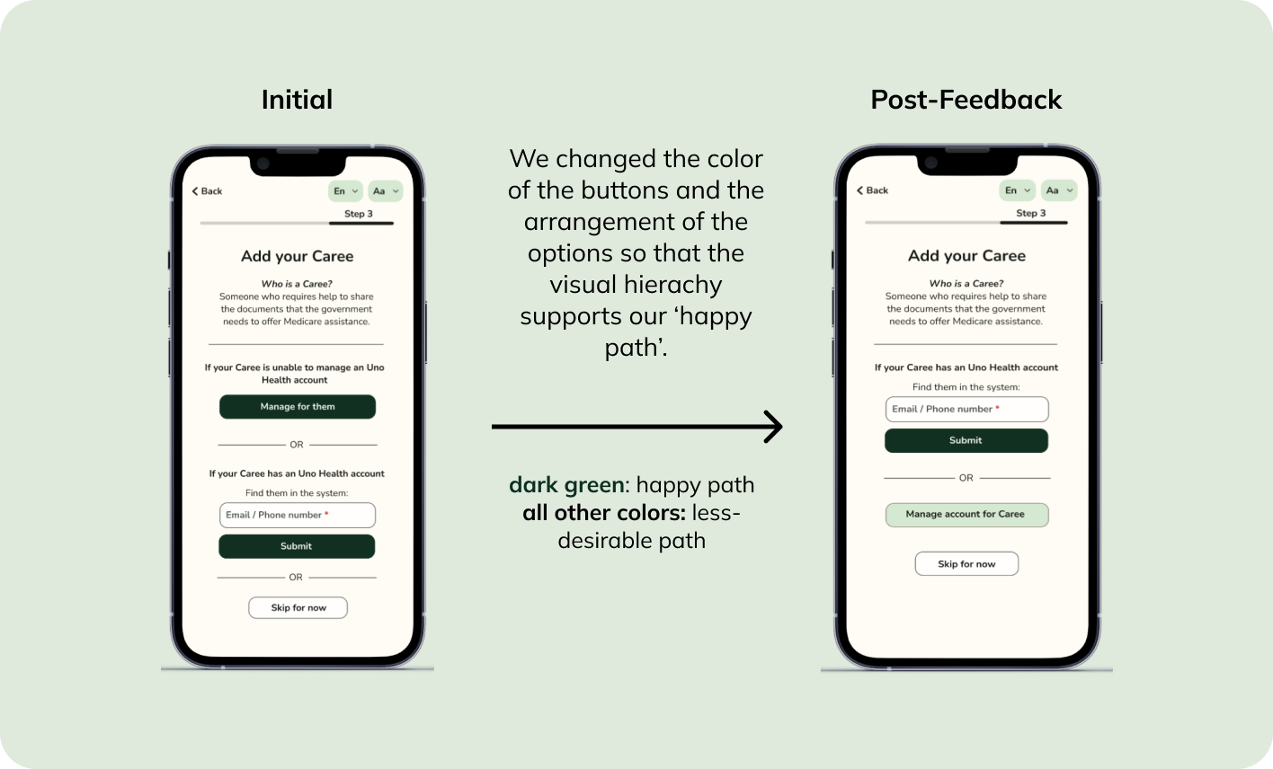
- To think of what the 'happy path' for the user would be, and ways in which we could nudge the user towards it. One example of a happy path that she gave us was nudging caregivers to link their accounts to that of an existing Uno member, despite the registration flow providing multiple other options for the caregiver.
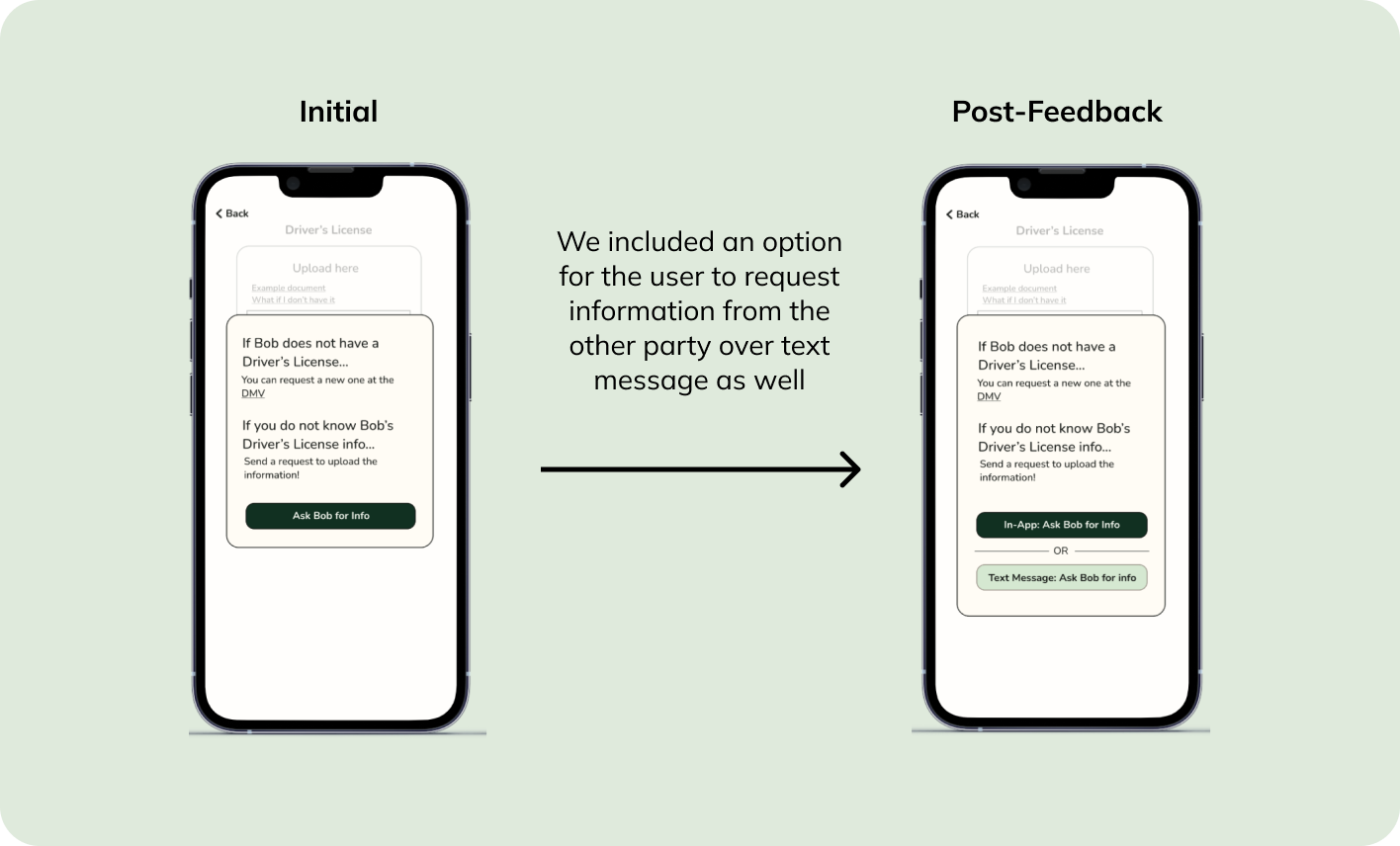
- To think of ways for users to interact with the Uno process without having to download the app/be a member.
In response, we made the following changes to our design:
Final Product
After many iterations, this is our final design! We delivered our final product to Uno Health through a high-fidelity prototype on Figma. Our design includes both an Eligibility Check Flow and a Member Flow.
Finalized Product Design
Our App in Action
Here is a sample run-through of the Caregiver flow on our app!
Reflections
This project was a great opportunity for me to practice product design and incorporating actionable feedback into my work. It was extremely fulfilling to be able to work with a startup like Uno Health, given the value that they bring to their customers. If I could repeat this process, I would have been more adventurous with my designs, and approached the project without prior knowledge of Uno Health's existing interface. Doing so would have forced me to think outside the box, and I think I would have created a more interesting design.
Future Direction
In a future design sprint, I would love to keep building out the prototype to:
- Include animations that would guide users seamlessly through the flow
- Test our prototype on end users to figure out where assumptions we made may have fallen short
- Design what the Caregiver portal may look like after the point of application. How might caregivers continue to provide help to their carees throughout their time on Uno Health?
Exploring this route would allow me to continue realizing Uno's mission of lowering the barrier of entry to Medicare benefits for all those who are eligible. Thank you for staying till the end! :)